Content is the king in professional writing; how it is presented plays an important role in the success of a book. The layout of a finished book is not just aesthetically pleasing; it goes to the very core of readability and can engage or repel your reader. For every professional book writer, mastering the art of a highly created layout differentiates good work from great ones.
This blog explores the reasons why every book writer needs a professional layout, seeing into its main contents and how it converts a manuscript to a professional and reader-friendly book.

What does a polished layout of a professionally written book look like?
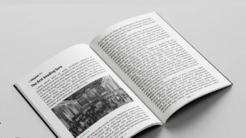
The design of a good layout deals with the proper placement of all the visual elements that go into composing a book typography to images, headings to page breaks-in a thoughtful and considerate manner. This is more than making the book pretty; it is about creating a seamless reading experience that elevates the content and respects both the reader’s time and attention.
Principal factors of a subtle design include the following.
- Typography: font selections, size, and leading (line spacing)
- Page layout: margins, gutters, and alignment
- Chapter and Section Breaks
- Headers, footers, and page numbers
- Images and graphics
- White space
- Table of contents and indexing
- Consistency of Design
- Front and back matter
- Proofreading and formatting
A professional layout guides the reader’s eye, improves comprehension, and gives an impression of authority. This justifies, why Professional book writer has to master or find at least close professionals who are in charge of taking care of the respective elements.
Typography: Setting the Tone of the Book
Typography is the cornerstone of any professional book layout. Choosing fonts is not simply a question; it is a matter of style that goes well with the genre, mood, and audience of the book.
Font Choices Matter
The readability of the book is different based on font choice. Classic books best use Times New Roman and Garamond serif fonts, which are common and more readable. On the other hand, modern and digital publishing is best done with Helvetica or Arial styles of sans-serif fonts. A well-put layout also tends to use the right fonts, which are supposed to go hand in hand with the tone of the text for smooth reading.
Font Size and Line Spacing
Aside from font choice, proper font size and line spacing are essential in keeping readers comfortable. If the font is too small, it becomes a chore to read; if it’s too large, then the book feels as if it is full of hot air, wasting space. Proper line spacing means the text does not feel cramped and looks clean on the page.
Consistency is Key
The typography remains consistent throughout the book. From the utilization of the same font within the body text to the sense of continuity in style and size. The predictability comprising an intrinsic part of this book’s visual rhythm relaxes the readers and allows their minds to be rapt by the story at hand rather than diverted by fluctuating styles.
Page Layout: Structuring the Reading Experience
A well-structured page layout makes the book polished, as it makes the content visually balanced and easy to follow.
Margins and Gutters
Margins are the open space between text and whichever edge it is on. This allows text some breathing room with space and not to feel crowded. Gutters are an in-between space between two facing pages essential in printed books, to maintain visual aesthetic appeal and preserve readability by preventing content from getting buried in the binding of the book.
Alignment for Readability
Alignment is also standard in professional composition, either left-justified or fully justified. A continued steady alignment prevents the text from looking scattered and uneven. Text alignment has a clear, intentional strategy for each book section to further facilitate the flow of the content.
Chapter and Section Divisions: Showing the Way of the Reader
Well-defined chapter and section breaks help give readers mental breaks, that go a long way toward comprehension.
Chapter Pages
Finishing touches regarding layout involve paying particular attention to chapter pages, as often these are set in larger fonts, with ornamental features, or even a blank page facing a new chapter. This produces not only a visual but also a psychological pause in the reader, preparing them for the transition between the parts of the book.
Section Consistency
The clear division into sections within the body of a larger chapter provides focus, which is achieved through the use of subheadings or thematic breaks, such as a line or symbol. If the chapters are well-sectioned, you can skim through them without much hassle, which is more enjoyable for the reader. After all, it is in fictional and educational books that readers do the most.
Headers, Footers, and Page Numbers: Locating Your Place in the Book
Heads, tails, and page numbers are functional guides to conduct the reader through the book but need only be obvious enough in their presentation, not obvious enough to intrude into the attention of the reader.
Discreet Yet Helpful.
Heads generally contain the chapter or title of the book which a reader knows what part of the book they are. Page numbers at the bottom or top corners must be consistent in the entire layout so that readers orient themselves easily.
The Strategic Use of Images and Graphics
Images, illustrations, and graphics have the potential to enhance a book, provided they are used judiciously. In a professional format, however, they are integrated in a manner to complete the text.
Image Placement and Quality
High-resolution images are an absolute necessity in a professional layout. One other thing to keep in mind: when the images or illustrations appear close to the relevant text, they should not be haphazardly broken or distorted-one is trying to enhance, not destroy the readers’ experience.
White Space: Introducing it into your design to allow it to breathe
White space is the open space around text and images. It involves everything highly important for two reasons: firstly, it makes everything more readable, and secondly, it gives a clean look, not cluttered.
Balancing Density and Clarity
Too little white space makes the page crowded and dense; too much makes the page sparsely occupied. A refined design balances the right amount with enough spacing between so that the text keeps on inviting and is easy on the eyes.
Table of Contents and Indexing: Navigational Tools for Readers
The TOC and the index are not just formalities but very practical devices enabling readers to trace any given information without much hassle.
A Clear, Organized Structure
A well-structured table of contents gives the reader an overview of the structure of the book, and as such able to find chapters and parts without frustration. To this end, in addition, a detailed index is also all-important for non-fiction and reference books: an efficient means of locating without the need to flip through pages and waste lots of precious time.

Design Consistency: Keeping in Line with Aesthetic
It shows consistency in design elements like font, color, and even ornamentation that creates a professional feel to the layout of the book.
Thematic Design
Whether your book is a novel, memoir, or how-to guidebook, carrying one theme throughout the design amplifies the reader’s involvement and engagement with the material.
Front and Back Matter: The Required Structure
The front and back matter in a book sometimes becomes an oversight, but it is very important in a finished layout.
Front Matter
Matter that appears at the beginning of a book includes the title page, publisher and copyright information, foreword, and table of contents. It contextualizes and orients the reader to the book as a whole to frame subsequent content.
Back Matter
The back includes appendixes, an index, bios, and acknowledgments. Adding this to give the reader more context with further resources and to round out the structure of the book.
Proofreading and Formatting: Perfecting the Finishing Touches
No matter how nice the layout, grammatical errors, spelling mistakes, or incorrect formatting take a lot of professionalism away from the book.
Attention to Detail
A finished composition is heavily proofread for typos, formatting errors, and other awkward line breaks. Avoid widow/orphan lines, where a single line of a paragraph or other text shows up all by its lonesome at the top or bottom of the page.
Print vs. Digital Layout: Integrating into Various Platforms
Books these days are usually published in both print and electronic versions, so a sophisticated layout needs to take into consideration the different mediums applied.
Print Considerations
For printed books, margins, gutters, and binding have to be taken into consideration for the content to remain clear and professional-looking on physical pages.
Digital Adaptation
With eBooks, the formatting needs to be flexible with screen sizes and orientation. Just like your book looks professional in print, so too should it be on a device, whether that be via a Kindle or a tablet.
Conclusion
A polished book layout is more than an aesthetic option. It is a critical part of the reader’s experience and the success of Professional book writer. Paying attention to all the little details, such as typography, page layout, and continuity, takes your manuscript and transforms it into one professional whole that keeps your readers going from cover to cover. It not only enhances readability but also gives a credibility factor to the writer about his authority in writing quality eBooks.

